Validated field
A label above a control.
.required marks the control required for screen readers and shows a marker after the label while it is true. .error shows the message under the control and paints the control invalid while it is Some. The control is marked invalid while an error shows and is described by the message.
GUITUIRuns in the browser
fieldPreview
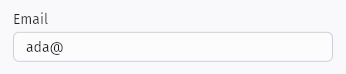
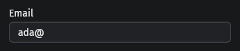
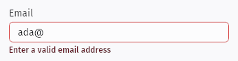
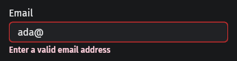
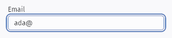
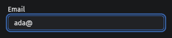
Usage example
fn validated_field_demo(error: Option<String>) -> FieldBuilder<TextFieldBuilder> { field( "Email", text_field(signal(String::from("ada@"))).placeholder("name@example.com"), ) .error(signal(error)) }fn validated_field_demo( error: Option<String>,) -> FieldBuilder<TextFieldBuilder> { field( "Email", text_field(signal(String::from( "ada@", ))) .placeholder("name@example.com"), ) .error(signal(error)) }States
- Default
- Focused
- Invalid
API
| Name | Signature | Purpose |
|---|---|---|
field | `fn field<C: IntoNode>(label, control: C) -> FieldBuilder<C>`; `.error(impl Reactive<Option<String>>)` when `C: FieldControl`; `.required(impl Reactive<bool>)` | A label above a control. .required marks the control required for screen readers and shows a marker after the label while it is true. .error shows the message under the control and paints the control invalid while it is Some. The control is marked invalid while an error shows and is described by the message. |