Tabs
Tabs.
Each tab adds a label and its content component; the component builds once, so a tab keeps its state while another is shown. When tabs have content, the active tab's content fills the space left below the tab strip.
GUITUIRuns in the browser
tabsPreview
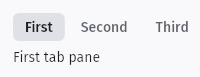
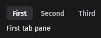
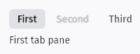
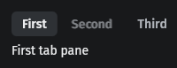
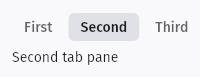
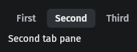
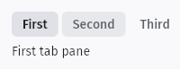
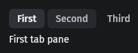
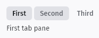
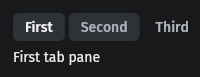
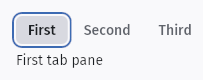
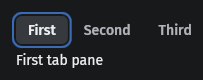






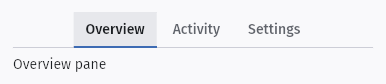
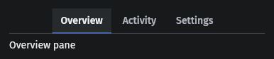
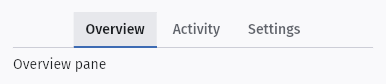
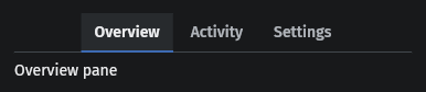
Usage example
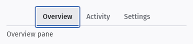
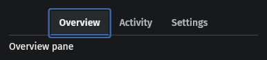
fn tabs_demo() -> TabsBuilder { tabs() .active(signal(0_usize)) .tab("First", move || text("First tab pane").nowrap()) .tab("Second", move || text("Second tab pane").nowrap()) .tab("Third", move || text("Third tab pane").nowrap()) }fn tabs_demo() -> TabsBuilder { tabs() .active(signal(0_usize)) .tab("First", move || { text("First tab pane").nowrap() }) .tab("Second", move || { text("Second tab pane").nowrap() }) .tab("Third", move || { text("Third tab pane").nowrap() })}fn tabs_line_demo() -> TabsBuilder { tabs() .active(signal(0_usize)) .tab("Overview", move || text("Overview pane").nowrap()) .tab("Activity", move || text("Activity pane").nowrap()) .tab("Settings", move || text("Settings pane").nowrap()) .line()}fn tabs_line_demo() -> TabsBuilder { tabs() .active(signal(0_usize)) .tab("Overview", move || { text("Overview pane").nowrap() }) .tab("Activity", move || { text("Activity pane").nowrap() }) .tab("Settings", move || { text("Settings pane").nowrap() }) .line()}States
Default
- Default
- Hover
- Pressed
- Focused
- Disabled
- Selected
Line
- Default
- Hover
- Pressed
- Focused
- Disabled
- Selected
API
| Name | Signature | Purpose |
|---|---|---|
tabs | `fn tabs() -> TabsBuilder`; `.tab(label, component)`, `.active(Signal<usize>)` | Tabs. Each tab adds a label and its content component; the component builds once, so a tab keeps its state while another is shown. When tabs have content, the active tab's content fills the space left below the tab strip. |