Tooltip
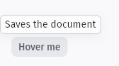
A hover tooltip.
GUITUIRuns in the browser
tooltipPreview


Usage example
fn tooltip_demo() -> NodeBuilder { container() .layout(LayoutStyle::flex_column().fill_width().padding_top(40.0)) .child( tooltip("Saves the document") .delay(0) .child(button("Hover me").ghost()), )}fn tooltip_demo() -> NodeBuilder { container() .layout( LayoutStyle::flex_column() .fill_width() .padding_top(40.0), ) .child( tooltip("Saves the document") .delay(0) .child( button("Hover me").ghost(), ), )}States
- Default
- Hover
API
| Name | Signature | Purpose |
|---|---|---|
tooltip | fn tooltip(label: impl Into<String>) -> TooltipBuilder | A hover tooltip. |